Client For :
Omiyago
Service :
Brand
Overview
New Product Development : Rahmat Chaerul
Creative Director : Widya Wicaksono
Graphic Designer : Nur Fadli Arifin
Photographer : Mimi
Background
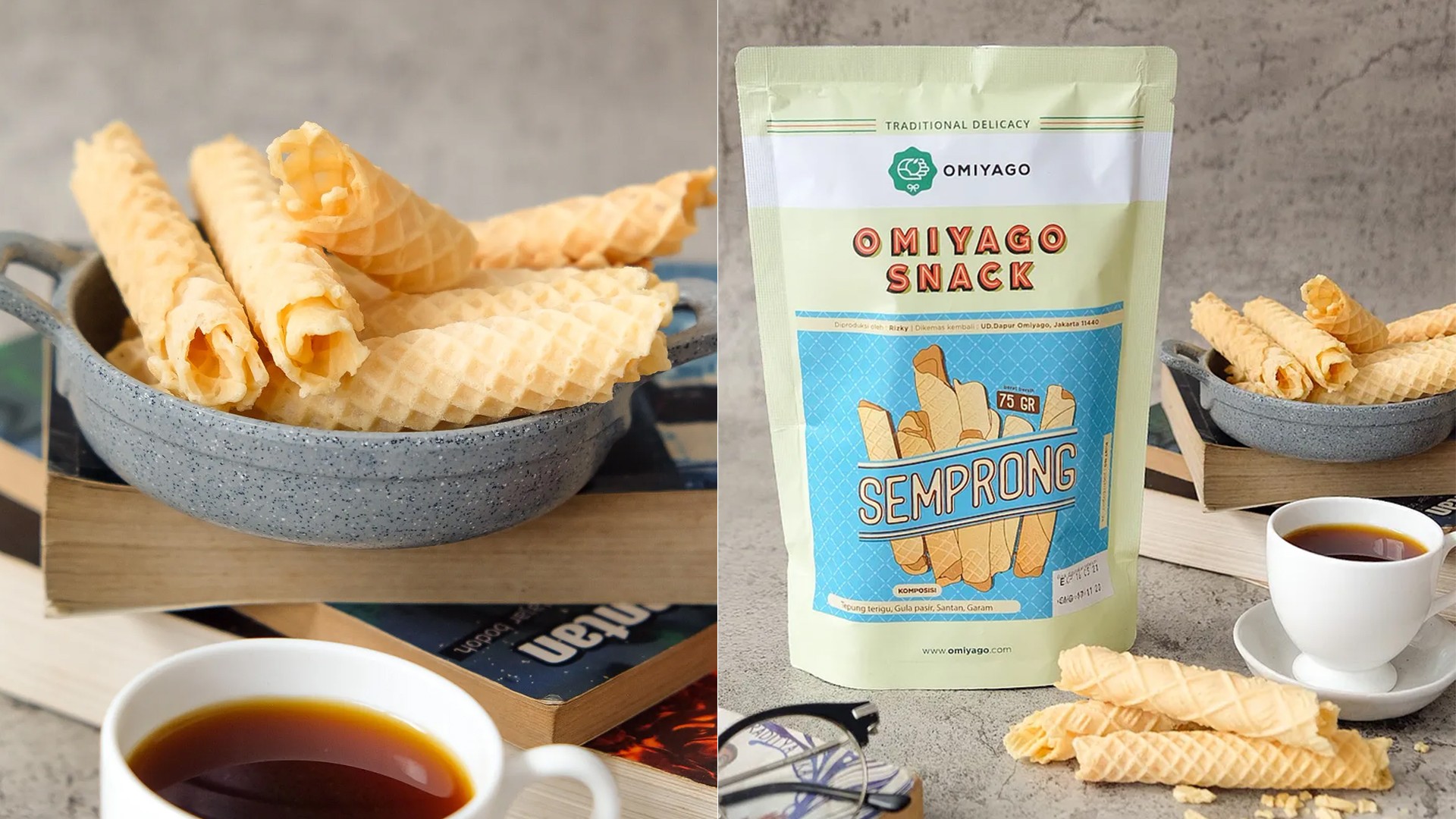
Opak is a beloved traditional snack from Indonesia, crafted from thinly sliced cassava roots. These crispy delights are meticulously seasoned with a blend of local spices, offering a symphony of flavors that tantalize the taste buds.
The beauty of Opak lies in its ability to evoke nostalgia, connecting people to cherished memories of sharing these flavorful chips during festive gatherings or simple moments with loved ones. Its presence in everyday life extends far beyond just a snack; it represents a passage of traditions, a homage to ancestral techniques, and a celebration of local flavors.
Idea & Concept
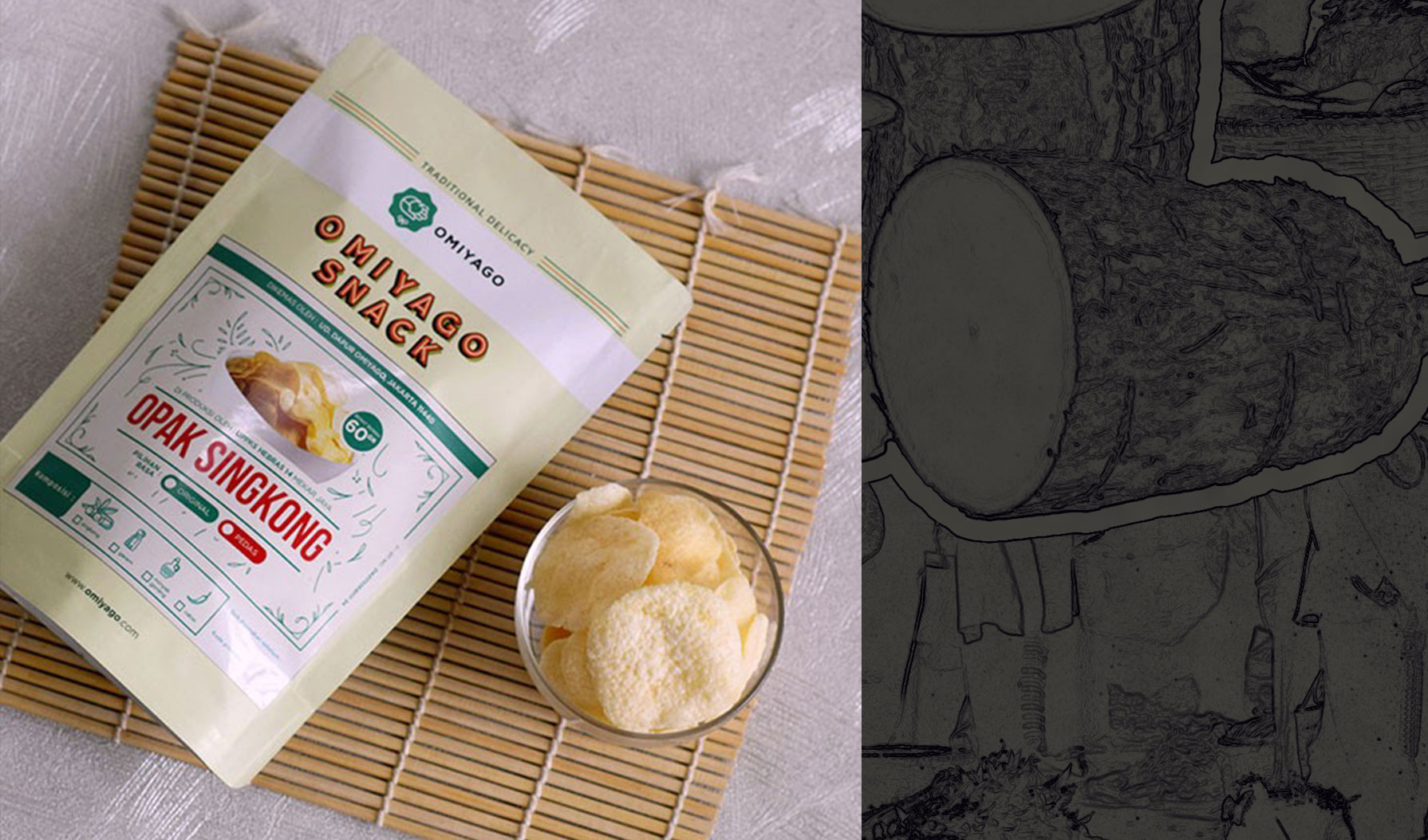
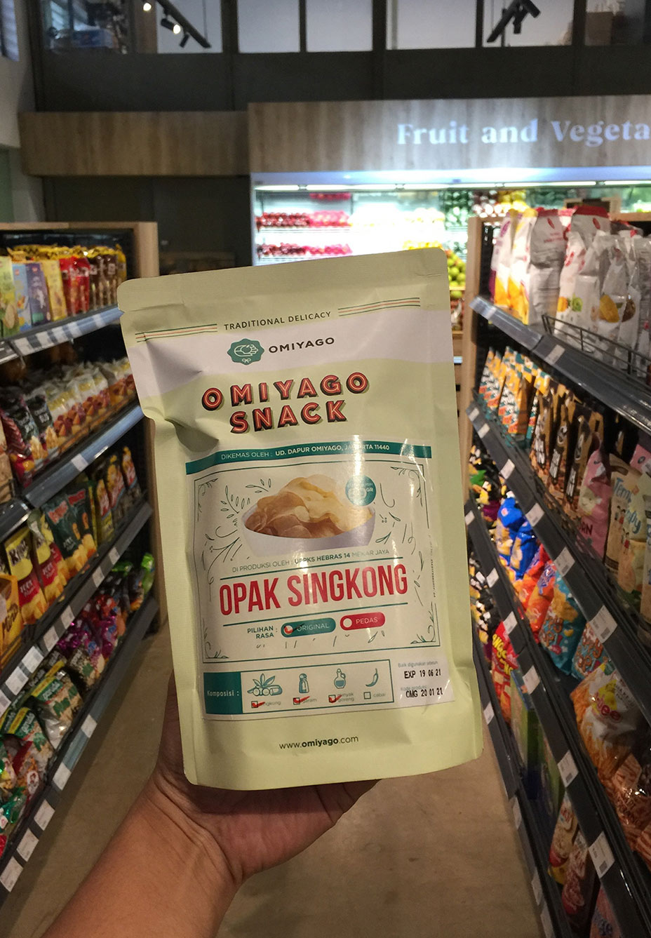
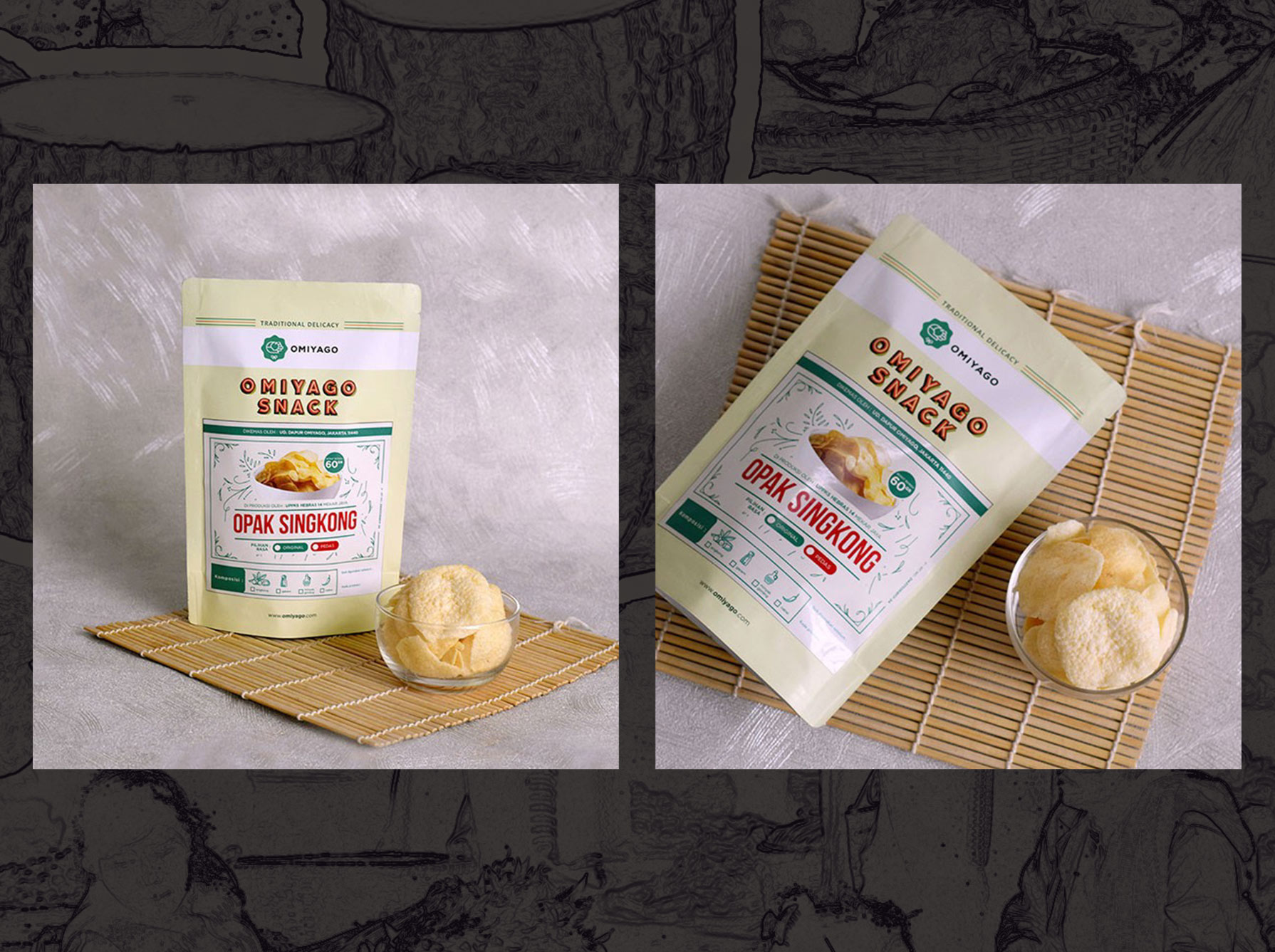
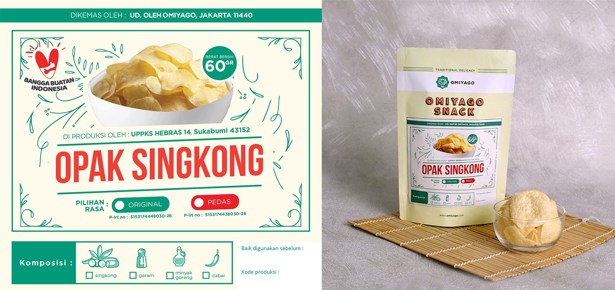
Omiyago’s concept for the Opak packaging design goes beyond highlighting its delicious taste. Opak represents more than just a snack — it symbolizes Indonesia’s cultural richness, acting as a global ambassador for its culinary heritage.
The packaging concept revolves around simplicity for efficient production and convenient portability during travel. Designed to be compact and travel-friendly, it accommodates various taste variations and packaging sizes seamlessly.
Its an evolution from tradition to innovation mirrors the resilience of Indonesian culture, welcoming both local communities and international admirers to immerse themselves in the diverse history and flavorful essence of Indonesia.
Related Post
Blog
As a Creative Enthusiast, I love exploring visual experiences through graphic design, illustration, motion design, UI/UX, and branding. In my free time, I enjoy drawing, music, movies, reading, and playing MMO games. If you see a monk walking alone in Durotar, just say hi—perhaps it’s me. I believe new challenges bring new adventures and opportunities for self-improvement.

